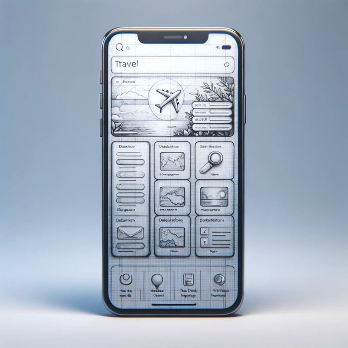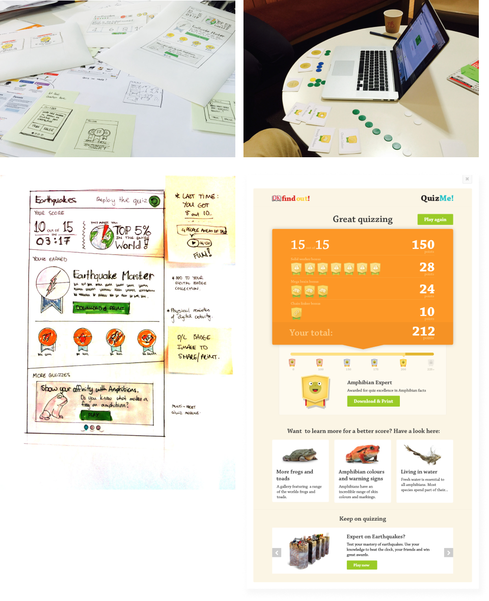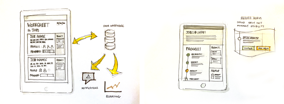
In a time when the cost of creating art is so cheap — and with transformative artworks being a series of prompts away (the image above took less than 30 seconds to create) — drawing/sketching, the mark making activity of putting pen to paper, appears totally superfluous. An echo of an fusty analogue processes from the past. Likewise, in a world of Figma components, and design systems that underpin a drive for rapid prototyping, why would spend time on an activity that seems to run counter to a build fast culture? Drawing, which I broadly see as the mark-making activity of putting you ideas and thoughts onto paper, offers so much more to the digital design process. Its not just a lo-fidelity image making creation tool, nor is it just an alternative tool for rapid (paper) prototyping thats been supplanted by digital tools. Drawing offers much more to the design process beyond artefact creation. Drawing focuses your thinking process. Like writing, it helps you understand the problem better, and it helps you communicate it more clearly to others. I want to spend some time looking at how drawing, simultaneously drives and improves my design work and why I think its actually an overlooked skill. It’s easy to say ‘it makes the work better’ — but in what ways is it make my work better?
Scaling your thinking
Digital design often requires you to scale you thinking between an individual point of a product experience, and the wider service offering. This, often rapid, shift in viewpoint is required to understand the differing contexts that a user connects with your product or service. Think of the self-checkout experience of a grocery store and then think of the wider shopping experience. Each sit in relation to one another. And connecting those moments of the Point-of-sale checkout with the browsing experience (think product photography, pricing formats, etc) is exactly the kind of considered design that needed to create great digital experiences.
The challenge is keeping those (and often other) contexts in play simultaneously.
I do an exercise with 1st year students where I get them to generate ideas to solve a fictitious customers issues with grocery shopping. This is useful, as most students have first hand experience of shopping for groceries and can easily recall issues and pain points from their own store visits. They are restricted to creating 3 or 5 panel storyboard, which both limits the extent of the customer journey but it also forces the students to adopt a birds-eye of whats going. You can’t go that deep with a 5 panel story board of the shopping experience. We then change our focus to single part of the digital experience, that could be the self-checkout or perhaps another digital tool to help users locate items in the store. Students are then forced to think at the level of the device and the interface which then forces them to consider both the impact of their digital experience may have on the wider shopping experience and vice versa. The interplay between these two scales and the thinking that occurs to successfully resolve this relationship is a powerful mechanism in shaping robust experiences. Not only is the wider service experience improved, but the detailed interaction design, full of greater context, is far more meaningful and effective.
“Always design a thing by considering it in its next larger context — a chair in a room, a room in a house, a house in an environment, an environment in a city plan.” — Elial Saarinen
Drawing matters here because its a technique that supports exploration at the speed of our cognitive process. The speed at which you are able to storyboard out a wider service experience, alongside detailed elements of interaction, helps you shift you thinking between these different contexts and points of focus. I haven’t found a tool that can do that as well as drawing.
No-undo button
There is no proper ‘crtrl-z’ in drawing. Pencils and erasers are close but are still not the same thing as being able to back up what you’ve done. The act of putting stuff onto a page — especially if you use ink rather than pencil — forces you to make decision on what to do. Some writers cite pen and paper as way to boost their effectiveness. It help them think more clearly. What they write with a pen already has a level of inspection to it. They’ve thought about what they’re putting down. They’re committing to it. And as it’s permanent, its a mechanism to move forward — there are no re-writes. They write and then continue to write. Editing comes later.
This also applies to design. And is especially effective at the start of the process. When confronted with a big white sheet of paper often the best tactic is to just start. Having an undo button though, means you can erase and re-create — and that’s not the point here — you’re writing not editing. Sketching interfaces and experiences has the same effect. This is the nuts-and-bolts process of making and shaping our ideas, through interface elements, story boards, comments in the margins and notes to your future self when you’re at work tomorrow and looking at what you’ve done. If what you’re creating can be undone and then re-done, there is no record of you thinking, all you have is the end result. This means you’re not thinking through the problem as deeply as you could as you cant continually reference (in the form of other sketches) concepts and ideas that you’ve jotted down. They’re erased, and part of a document history that NO-ONE ever looks at.

Play better with others
The nature of drawing also makes sharing less problematic. And by sharing I mean the typical communication that occurs in organisations when you need to communicate ideas and artefacts to other people so you/they can make decisions. This is especially in the early stages of a project, when the problem and solution space? Sharing occurs in all levels of a project, from larger presentations to communication to team mates, developers, managers and so on. In these contexts, being able to express your ideas clearly is a massive advantage as it quickly helps team-mates align their differing perspectives. I’m not just referring interface mock-ups either, sketching can show stages of an experience, analogue touch points and digital components, user flows and meting notes — all levels fidelity and detail, to help answer the question — “ is what I am thinking the same thing you’re thinking?” It’s also cheap, not just to produce, but also by avoiding the cost of miscommunication. If the team is thinking different things, then you don’t want to find this out when the product is just about to be released.

So why bring this up?
I currently teach 1st year UX students and it is one thing I encourage all of them to develop further is their drawing skills. Draw and think — draw flows, storyboads, diagrams, interfaces. However, It’s not in their current ambitions of tools or techniques they feel they need to master. Getting ‘good at Figma’ and other visualisation/prototyping tools are much higher on their agenda. Likewise, there is another drive towards the utilisation of design systems and component libraries to help rapidly prototype digital experiences. I’ve read several criticisms of the the over-reliance on design systems leeches good thinking from the design process, as designers are simply assembling pre-build components.
Similarly AI tools — see Framers AI Site generator — are awesome in rapidly movement from idea to execution. It’s easy to see why these would also be incredibly attractive to people looking to build fast and make an impact. I use these tools all the time but the most common tool I have used in nearly 2 decaeds of commercial practice, has always been drawing. The practice of drawing has another ace up it’s sleeve: speed.
Slowing down often yields better results, and to do that effectively if often means using different tools. Tools that have inspection and introspection built-in, that rapidly help you understand different contexts, force you to create rather than assemble, and easily bring others with you. Drawing, the basic mark-making activity has all that.